Summary
I acted as lead UI/Product designer for Beauty Bakerie's e-commerce site hosted on Shopify. In order to help increase online conversion, I conceptualized and implemented a more cohesive, mature visual brand across the site and created reusable UI components to streamline the user experience and enhance interactivity.
CLIENT/ROLE
Client: Beauty Bakerie
Role: UI/Product Designer
SCOPE
UI design, creative direction/branding, e-mail and graphic design, testing
TOOLS
Sketch, Shopify, Adobe Creative Suite (Photoshop, Illustrator InDesign), Full Story
CONTENTS
Use the links below to skip to different sections:
UI Components
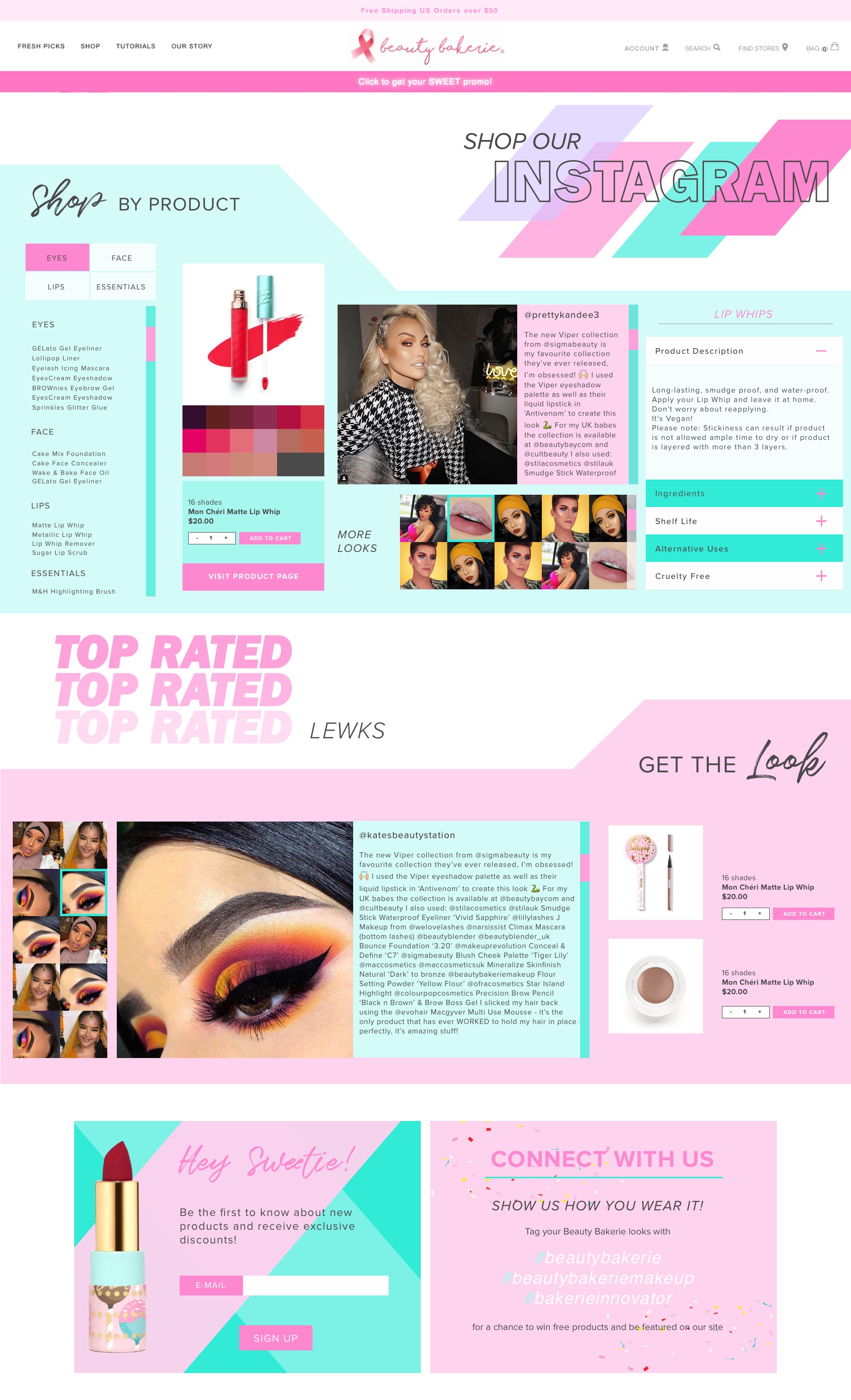
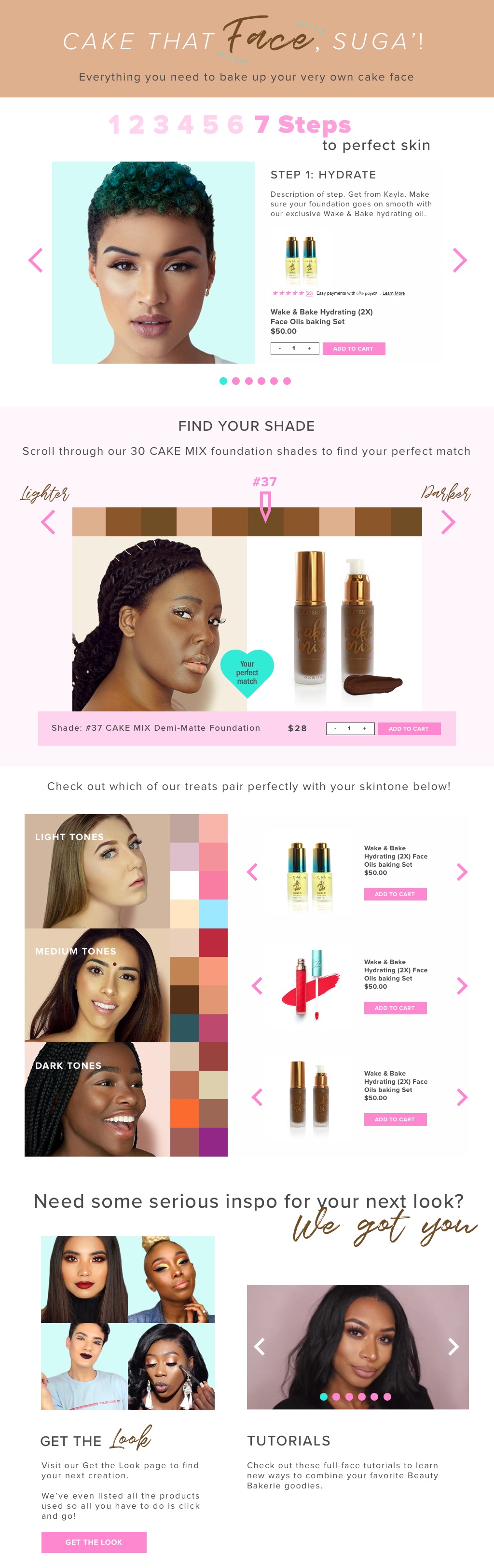
Here are a selection of UI components I created for Beauty Bakerie's e-commerce shopify site. The main purpose of many of these elements were to provide a more customized experience for the users while increasing the points of conversion and also the ease of adding products to the user's cart.
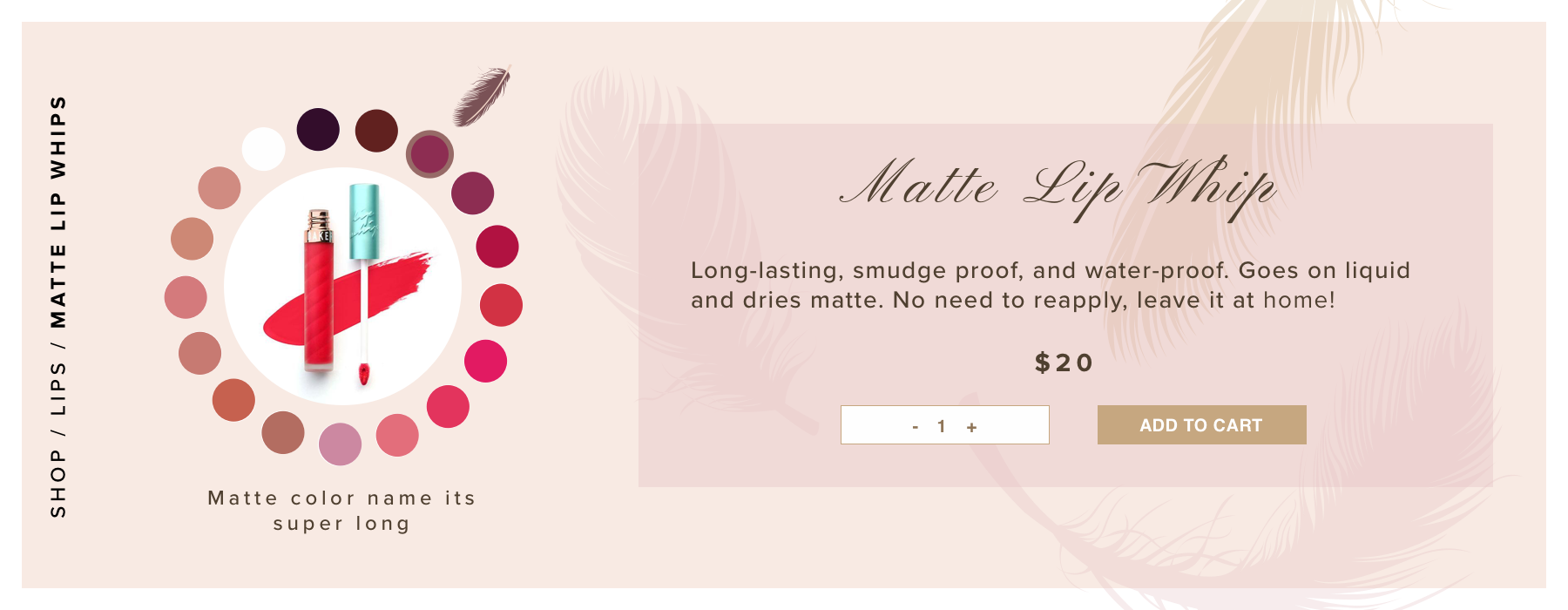
UI component #1: product selector
UI component #2: Rotating lipstick selector
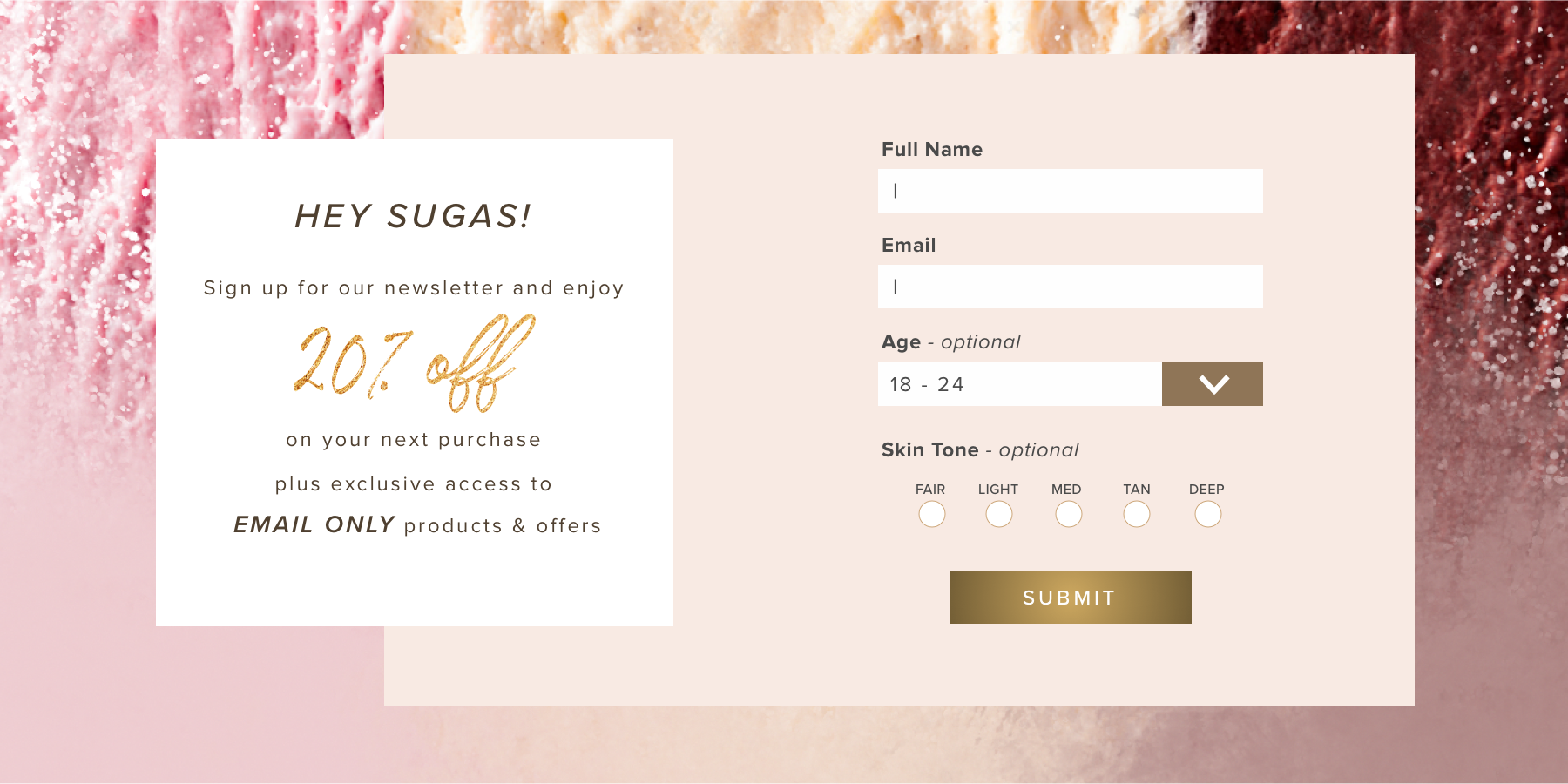
UI component #3: E-mail sign-up module
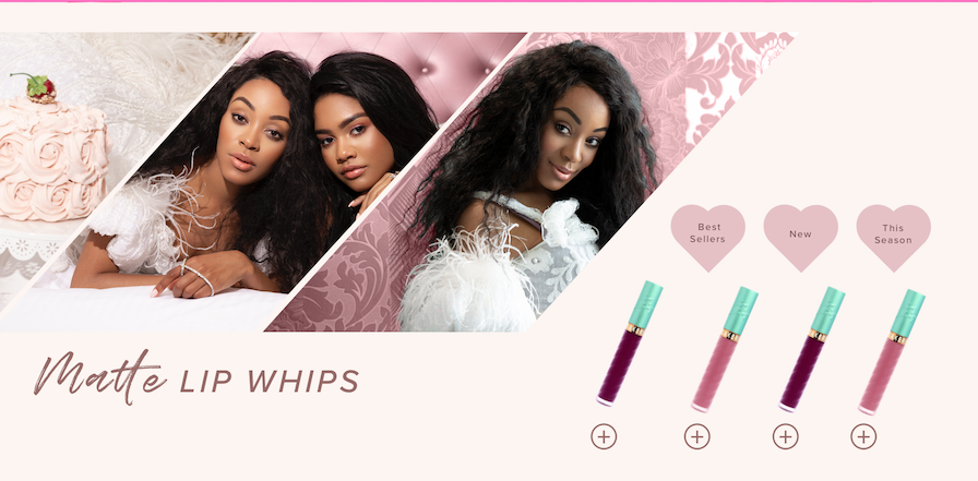
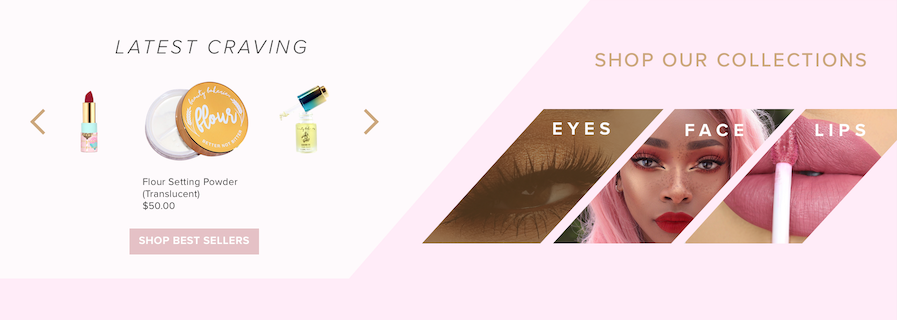
UI component #4: Best Sellers & Product Category CTAs
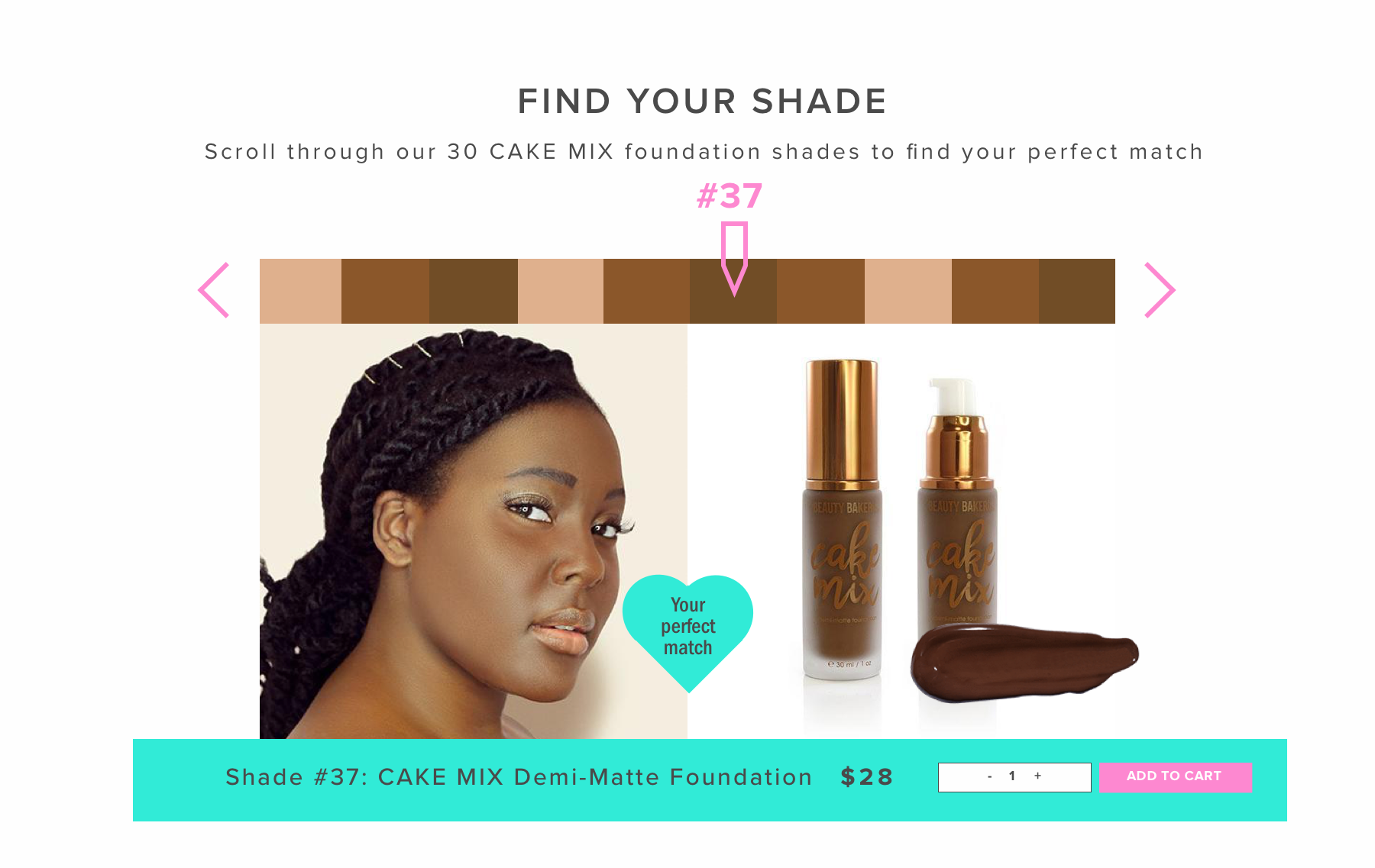
UI component #5: Foundation Shade Finder
Web Page Layouts
Experimental Landing Pages
Below are examples of the experimental "Pay-per-click" landing pages I developed for the company. Over the course of the project I developed about 12 of these landing pages, each highlighting a different best-selling product or adjusting to a specific traffic source.
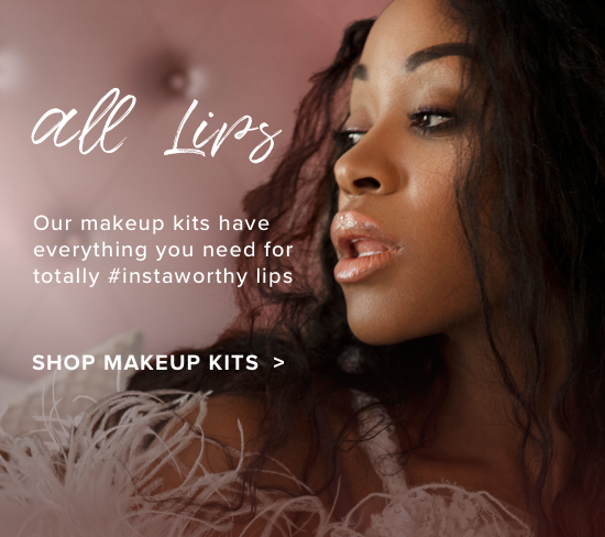
The following layout is a concept design that serves as a landing page for traffic from Instagram. The focus is to highlight User-Generated-Content and provide users with a streamlined experience to explore products used in their favorite looks.
Landing Page #1: Instagram
Landing Page #2: All Face Products
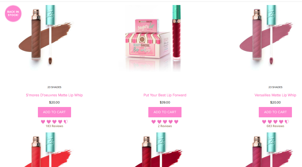
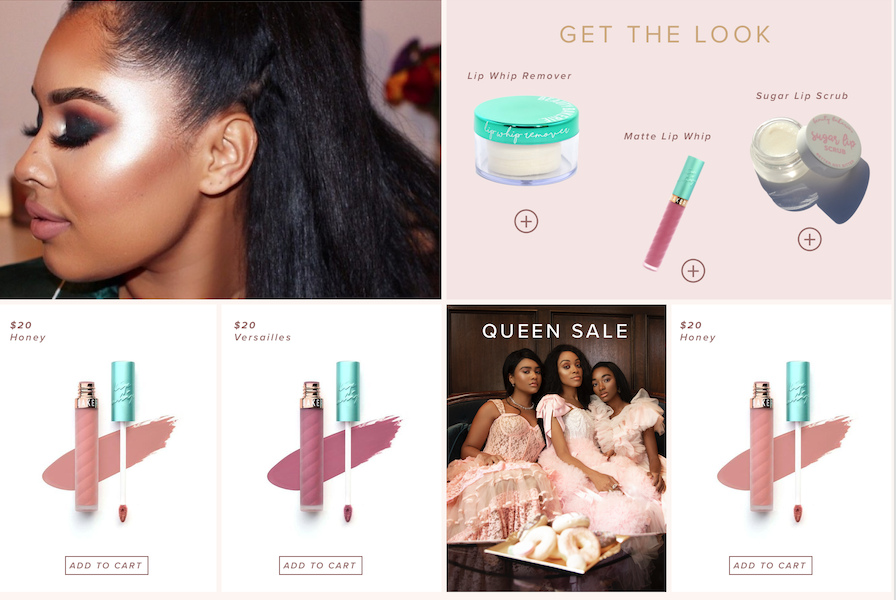
Collections Pages
Current collections pages on the Beauty Bakerie site follow a traditional grid layout, displaying only rows of products. To make these pages more engaging and to increase product exposure as the user browses, I decided to break up the products with smaller ads and content dispersed in a mosaic scheme. I also cleaned up the product labeling to allow the product imagery to truly shine on the page
Current Collections Page Format
Detail #1: Redesigned Collections
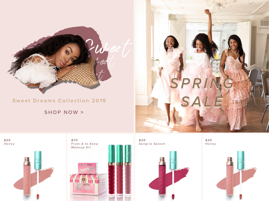
Detail #2: Redesigned Collections
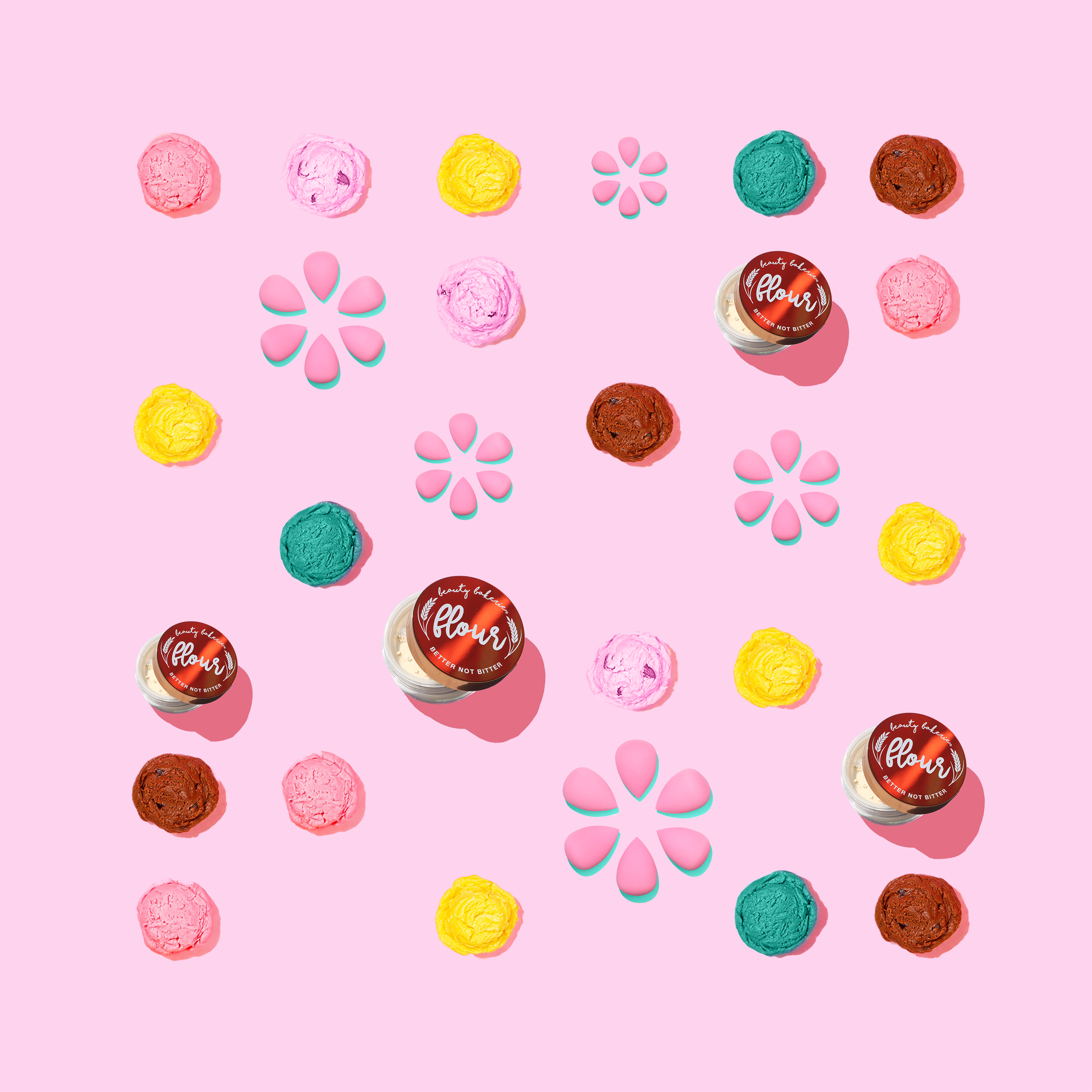
Branding
Mobile Banners
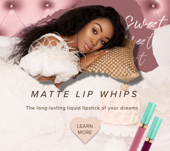
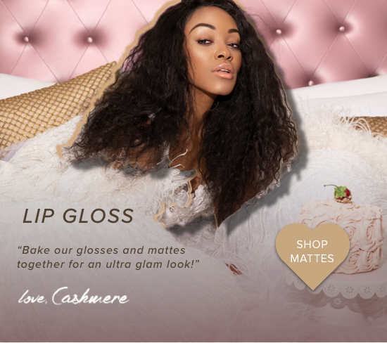
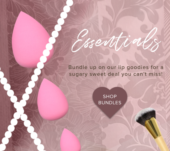
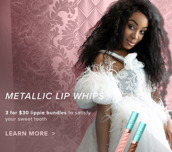
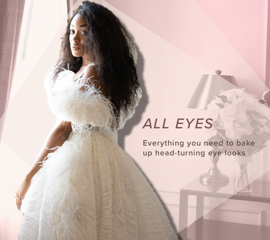
These are examples of mobile product page banners for the Marie Antoinette themed campaign titled "Let Them Eat Cake". The primary focus here was to use more sophisticated photography and color palettes, deviating from the loud pinks and turquioses of the past into a softer, yet undoubtedly bold, modern and feminine feel.
Mobile Banner #1
Mobile Banner #2
Mobile Banner #3
Mobile Banner #4
Mobile Banner #5
Mobile Banner #6
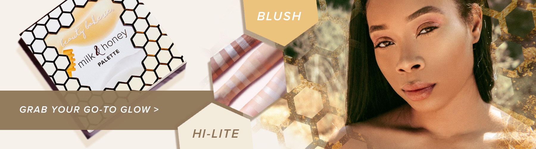
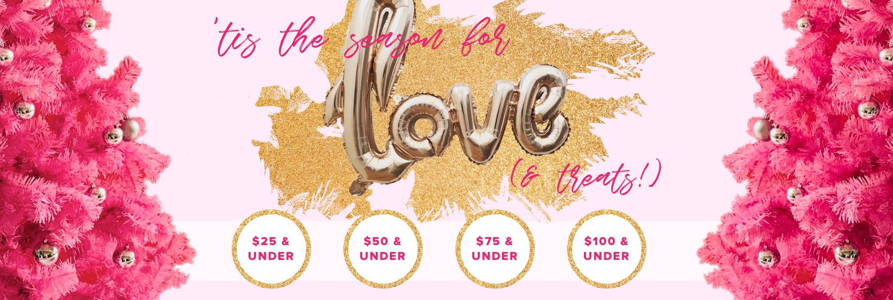
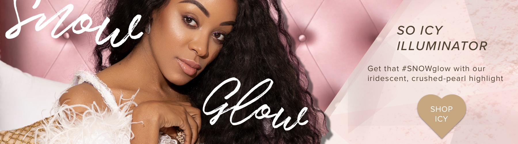
Desktop Banners
Below are examples of desktop banners for collection pages and the homepage.
Banner #1: Flour Power
Banner #2: Bakerie Christmas
Banner #3: Let Them Eat Cake
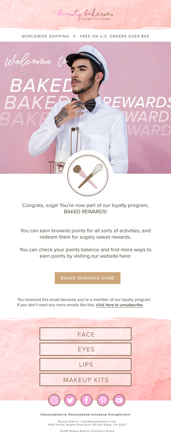
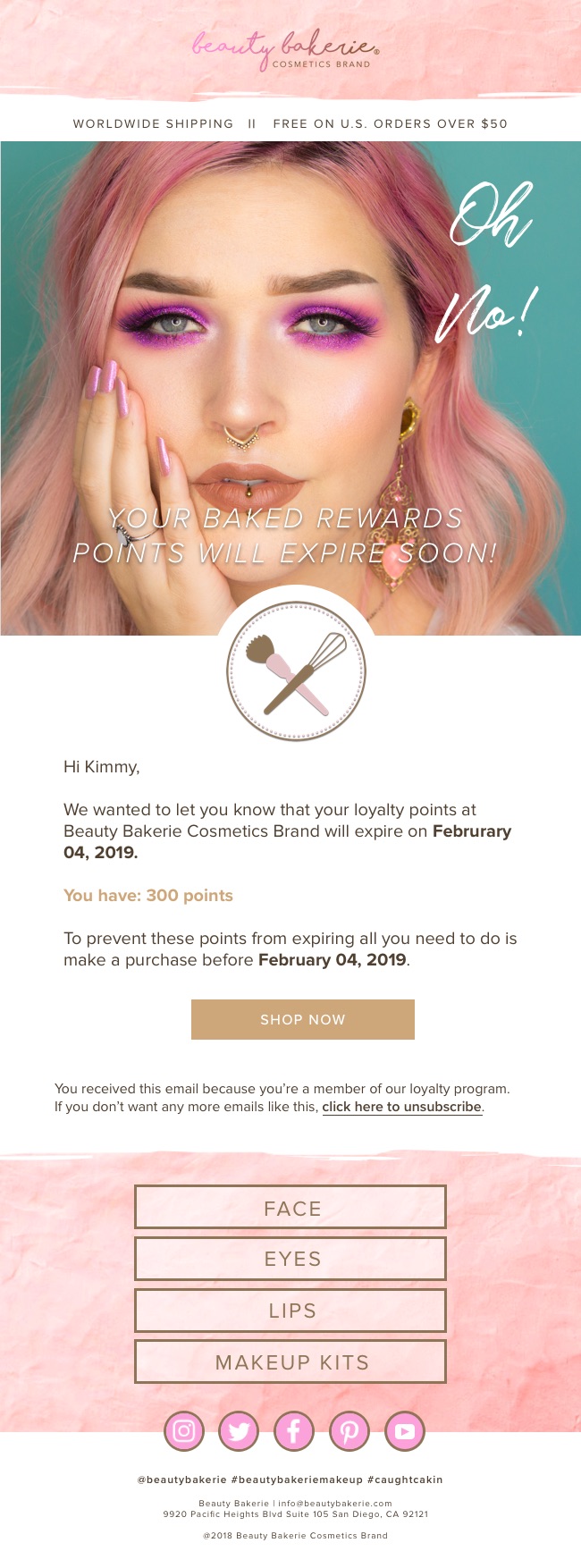
Email Design
Below are examples of some e-mail designs I made for Beauty Bakerie. The first two e-mail templates were used for the automated rewards program emails sent out. The last one was an example of a weekly product e-mail.
Email #1: Rewards Sign Up
Email #2: Point Expiring Soon
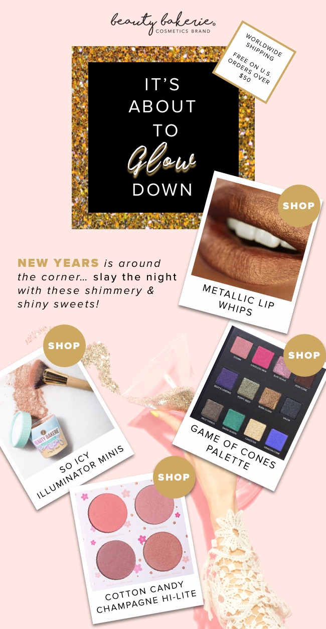
Email #3: Weekly product e-mail