Summary
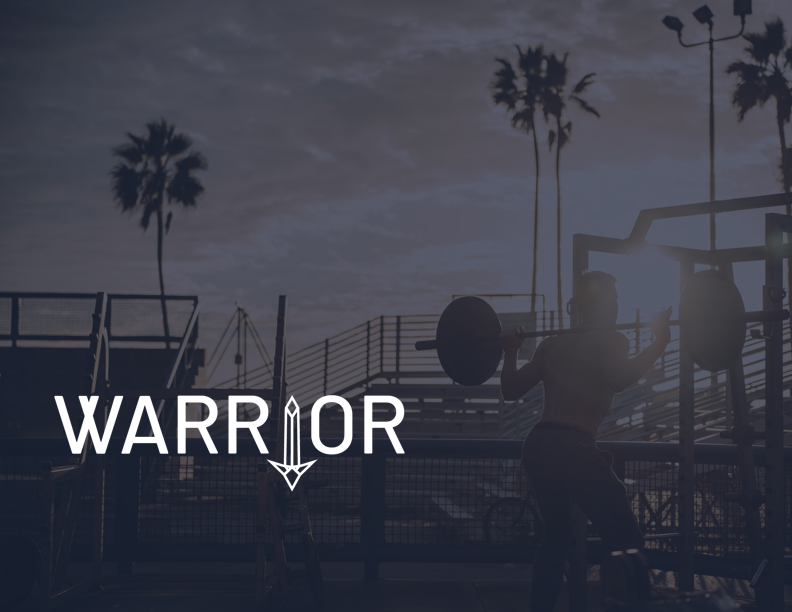
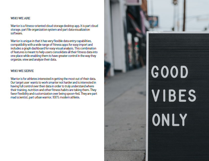
Warrior is a cloud storage and data visualization desktop app for the athlete that wants to truly understand where their training, nutrition, and other fitness habits are taking them. Warrior’s unique data entry, visualization, and compatibility features help users consolidate all their data in one place while giving them greater control in the way they organize, view, analyze and share their data.
I was responsible for the conceptualization, research and design of this product from the point of inception to the creation of a high fidelity, interactive prototype.
CLIENT/ROLE
Client: Warrior
Role: UI/UX Designer
SCOPE
User research, brand & identity development, wireframes, testing, and interactive desktop prototype
TOOLS
Sketch, Figma, Photoshop, Illustrator, MyBalsamiq, UsabilityHub, Draw.io, Omnigraffle, InVision
Problems
This product was built to address the following issues:
- Data captured in fitness apps is not always easily exportable
- Pre-set data visualization features = limits ways users can view data
- Limited data entry settings = limits analysis
Solutions
These solutions were incorporated into the product to help address the issues noted above:
- Compatibility with major fitness apps and cloud storage apps
- Full spreadsheet creation/editing capacity
- Graph dashboard with pre-formatted templates based on data type
PROCESS
Use the links below to skip to different sections:
Research
1.1 User Surveys
At this early stage, it was critical to get insights from a variety of users who participate in different sports and who have differing fitness goals in order to uncover the target audience’s core needs and pain points. In particular, additional information was needed for:
- User's data tracking methods
- Likes/dislikes for current tracking methods
- User file sharing habits
- Data visualization needs
To get insights on these questions, a survey was created and distributed online using social media and survey forums. The survey received 47 responses, primarily from athletes based in the United States, Europe and Latin America. The survey was distributed via e-mail, social media and athlete forums.
Some significant insights obtained from the surveys included:
- 98% of today’s athletes track wellness data
- 99% of respondents wanted compatibility with specific fitness apps
- 80% of users rated data visualization as a priority
- Nearly 50% of users exclusively use mobile fitness apps to track data
- 37.5% use a combination (Fitness app, cloud, manual)
- 12.5% manually track data
It was clear from these results that an overwhelming amount of everyday athletes track wellness data, that they want this data to be accessible on their phone, and that they want a solution that is highly compatible with other fitness apps and that includes graphing/visualization features.
1.2 User Personas
After analyzing the results of the surveys, two major groups of users emerged: competitive and recreational athletes. Follow-up interviews were required to dig deeper into these different types of users who undoubtedly had different goals and needs with regards to the product. It was important to do this because the product needed to be accessible and useful to a broad spectrum of athletes.
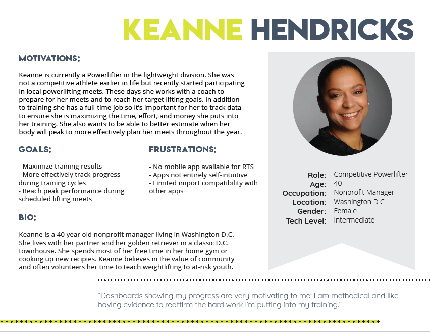
User Persona 1: Competitive Powerlifter
PERSONA DETAILS
NAME: Keanne Hendricks
ROLE: 40 Year Old Competitive Powerlifter
“Dashboards showing my progress are very motivating to me; I am methodical and like having evidence to reaffirm the hard work I’m putting into my training.” - Keanne Hendricks
GOALS:
- Maximize Training results
- More effectively track progress during training cycles
- Reach peak performance during scheduled lifting meets
FRUSTRATIONS:
- No mobile app available for data tracking app she’s currently using
- Many apps are no entirely self-intuitive
- Limited import compatibility with other apps
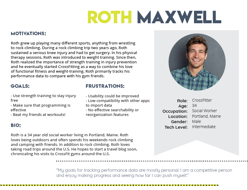
User Persona 2: Recreational CrossFitter
PERSONA DETAILS
NAME: Roth Maxwell
ROLE: 34 year old Recreational CrossFitter
“My goals for tracking performance are mostly personal. I am a competitive person and enjoy making progress and seeing how far I can push myself!!” - Roth Maxwell
GOALS:
- Use strength training to stay injury free/li>
- Make sure that programing is effective
- Beat my friends at workouts!
FRUSTRATIONS:
- Usability of most fitness apps could be improved
- Low compatibility with other apps to import data
- No effective searchability or reorganization features
1.3 Competitive Analysis

With so many cloud storage and fitness apps in the market, an analysis of the competition was needed to obtain an understanding of where the competitors were succeeding and where they were falling short in order to design a solution that filled the existing gaps. To accomplish this, a competitive analysis was conducted that included user flows of the fundamental features of the products.
When surveyed, users revealed that the top cloud storage and fitness apps they used to store wellness data were Google Drive, DropBox, and FitBot.
COMPETITOR STRENGTHS:
- Instant data visualization
- Extensive collaboration tools
- Wide range of features
- Ease of use
COMPETITOR WEAKNESSES:
- Pre-set data entry & visualization features
- Specificity on one wellness activity or sport (i.e. sleep tracking, running, macros) OR too general
- Difficult or impossible to export data
Read the full Competitive Analysis
View Competitor User Flows
Information Architecture
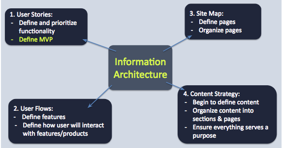
2.1 User Stories
Once the user surveys and competitive analysis were completed, the next step was to take the findings regarding the market and users’ pain points and use that information to prioritize features for the product. These features were detailed in user stories, which were then converted into user flows to further develop how the user would interact with the product.
Once the prioritized user stories and flows were completed, it clarified what features needed be in included in the minimum viable product (MVP). The results revealed that the product's core functions should support: consolidation, creation, organization, visualization and sharing.
View the full User Stories
2.2 User Flows
Developing the user flows provided the basis needed to develop low-fidelity wireframes by uncovering which specific elements would be needed in the product, as well as the relationship between the elements. Competitor user flows were drawn heavily upon when developing the user flows for Warrior to make sure common conventions were used and common pitfalls were addressed.
View the Warrior User flows
2.3 Sitemap
The sitemap defined the necessary pages and provided the basis to develop the content strategy document.
View the Sitemap
2.4 Content Strategy
Once the user flows, user stories and the sitemap were created, it was clear what needed to be included in the product, but, the elements still needed to be organized into pages. Content strategy to the rescue!
Read the full Content Strategy
Wireframes & Testing
3.1 Sketches & Wireframes
With the necessary information architecture work completed, sketching started to give shape to what the product would look like.
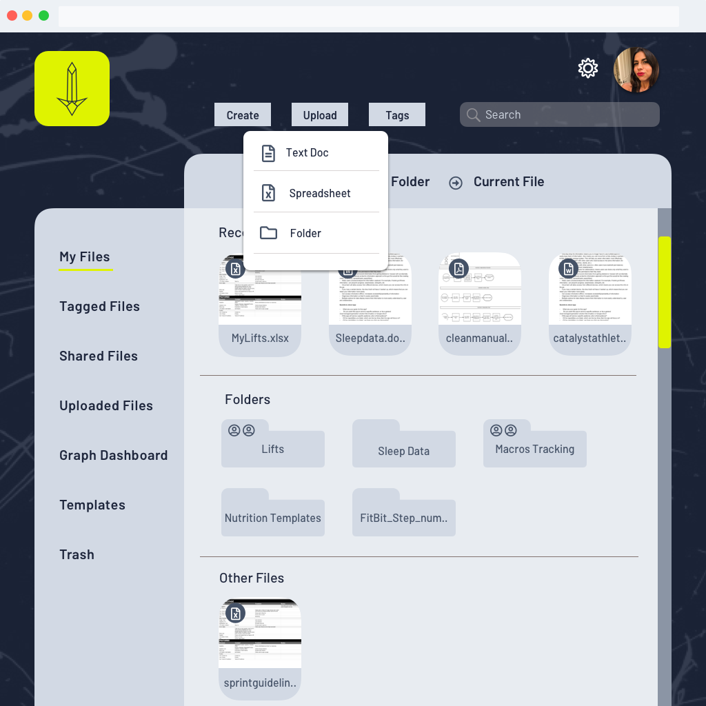
The sketches were then converted into the first iteration of wireframes, which were tested early on to help identify any significant usability issues. The most important finding from the first round of testing was that while users found the data visualization features exciting, they thought it would be helpful to include tools to help guide less experienced users with data entry and formatting graphs. To address this, a “templates” section was added to the user dashboard that would include pre-formatted spreadsheets and graph templates for different types of wellness data (i.e. sleep, nutrition, performance, etc.)
Review the full Usability Test results
View the low fidelity Wireframes
Branding
4.1 Attitude and Inspiration
As the product took form, it seemed appropriate that the brand pay tribute to the hard work and passion that everyday athletes put into their workouts. In contrast to many cloud storage solutions that opt to keep their branding generic and broad, I wanted the product to have an attitude and a point of view; one that embraced the heroism in the daily grind and was gritty in all the right ways. I wanted users to see themselves reflected, to know that this was a product created by people who understand their journey and who want to help them succeed.
4.2 Name
Much like the overall brand, the product’s name was inspired by the users. There is heroism, sacrifice, hunger and honor in the dedication people have to their fitness, particularly in the face of life’s daily trials and tribulations. Today’s athletes are warriors, fighting day by day to become better versions of themselves.
4.3 Logo
Expanding on the idea of a “warrior”, many logo versions were developed based on the tools/weapons/gear of ancient warriors. After many iterations, I landed on using the image of a sword.
Step 1: Brainstroming and Sketches
Step 2: Hi-fi iterations of logomark
Step 3: Logotype and final mark
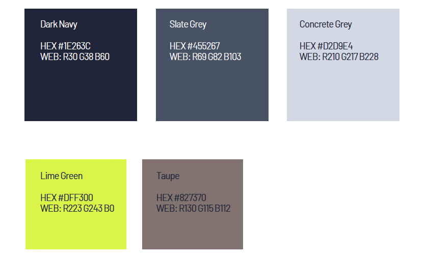
4.4 Colors
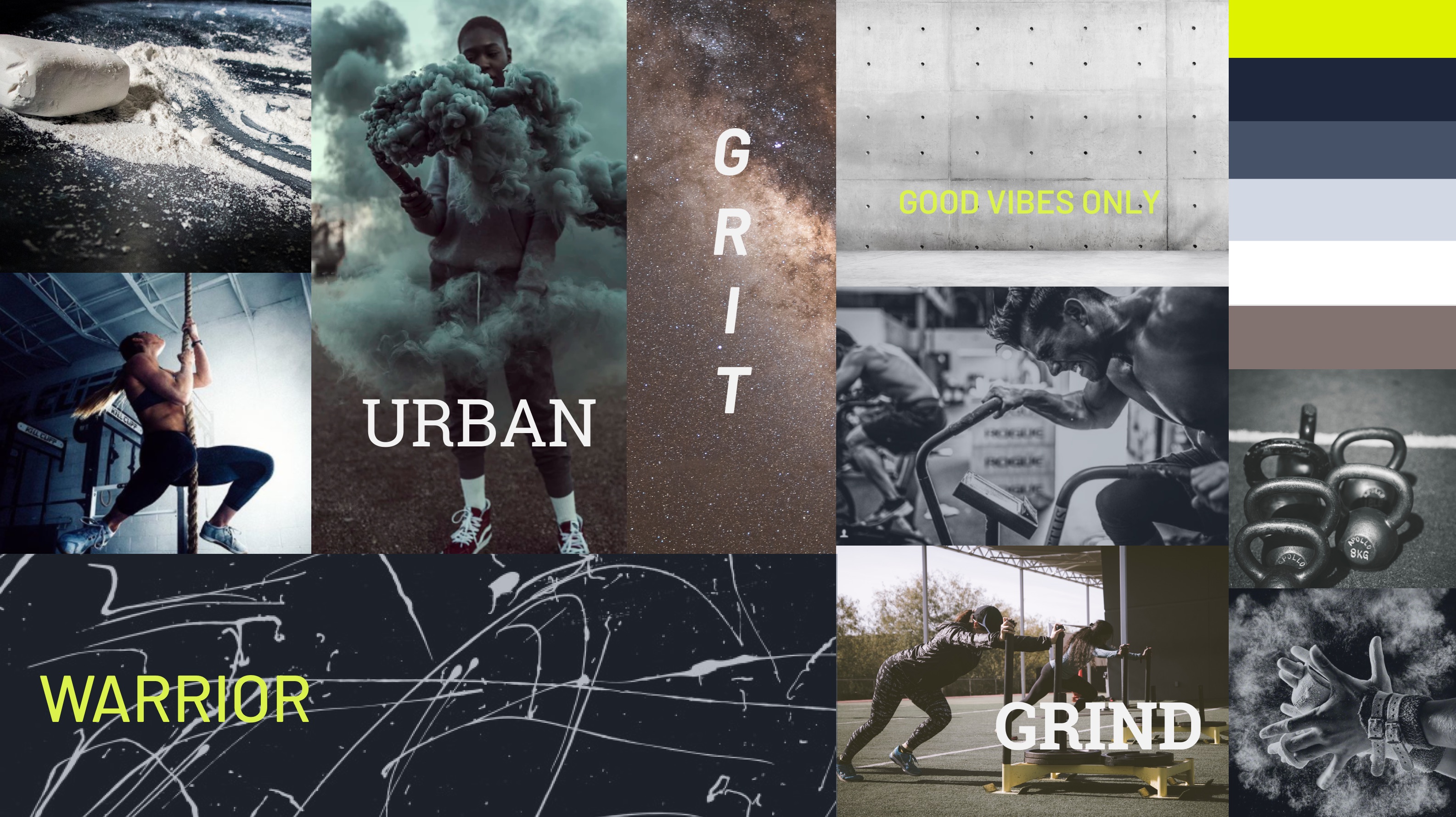
The color palette was inspired by the industrial and natural textures found inside a gym or on an urban running trail. I wanted to have a darker palette with some bright accents to evoke an edgy, modern vibe, reminiscent of today’s lifestyle brands.
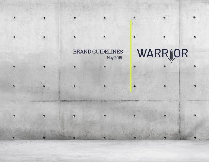
4.5 Style Guide Excerpts
Style Guide: Cover
Style Guide: Brand Essence
Style Guide: Typography
Style Guide: Imagery
View the Visual Design Documents:
Branding ResearchStyle Guide
Design System
Prototype & Testing
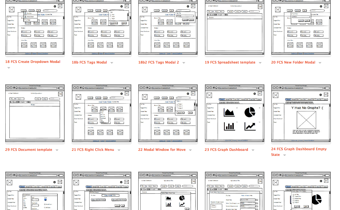
5.1 High Fidelity Wireframes
With the branding completed, it was time to create the first draft of the high fidelity mockups (see below).
5.2 A/B Testing & Changes
At this point, much of the visual identity was developed but feedback was needed on some important aspects of the user dashboard to ensure that the design was maximizing the legibility and visual organization of the product.
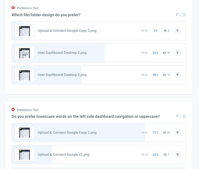
Some results from the A/B testing were clear, while others were a bit inconclusive. In particular, while the feedback for the folder/file design showed a slight preference for the navy icons versus the grey or outlined ones, it wasn’t decisive enough to make a clear decision.
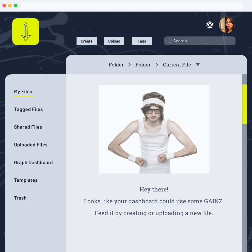
After some additional testing I implemented the grey file and folder icons because users tended to feel that the navy icons were visually heavy and that they competed with the background, while the grey icons made the dashboard seem less busy.
5.3 Final Prototype, Testing & Changes
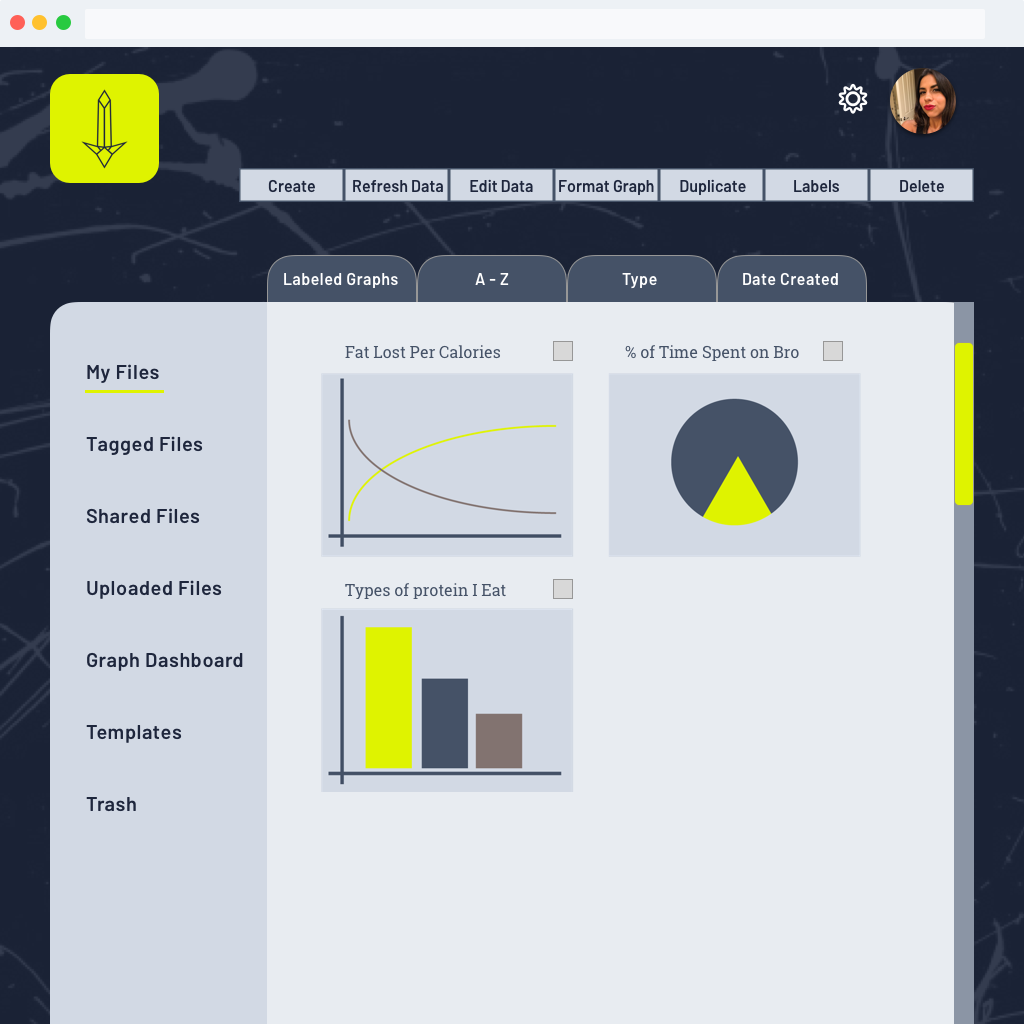
With the interface design completed, I ran a final round of usability testing to polish the final version of the prototype. The most important feedback I received was that the graph dashboard needed refinement to help the user navigate the new elements presented in that section and understand how they would be used to create graphs. It was also noted that the user dashboard could be opened up to allow for more white space and to allow the different elements to “breathe”.
The following changes were implemented based on the feedback:
- Increased kerning on all of the text and increased font size of select headers and labels
- Enlarged background of the user dashboard to open up space for the file/folder icons
- Reorganization of the button toolbar on the graph dashboard into two sections and add icons for increased usability
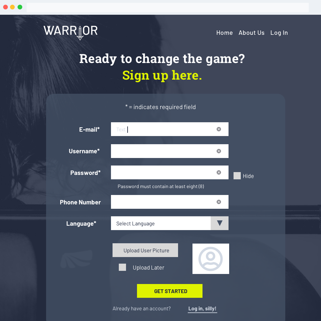
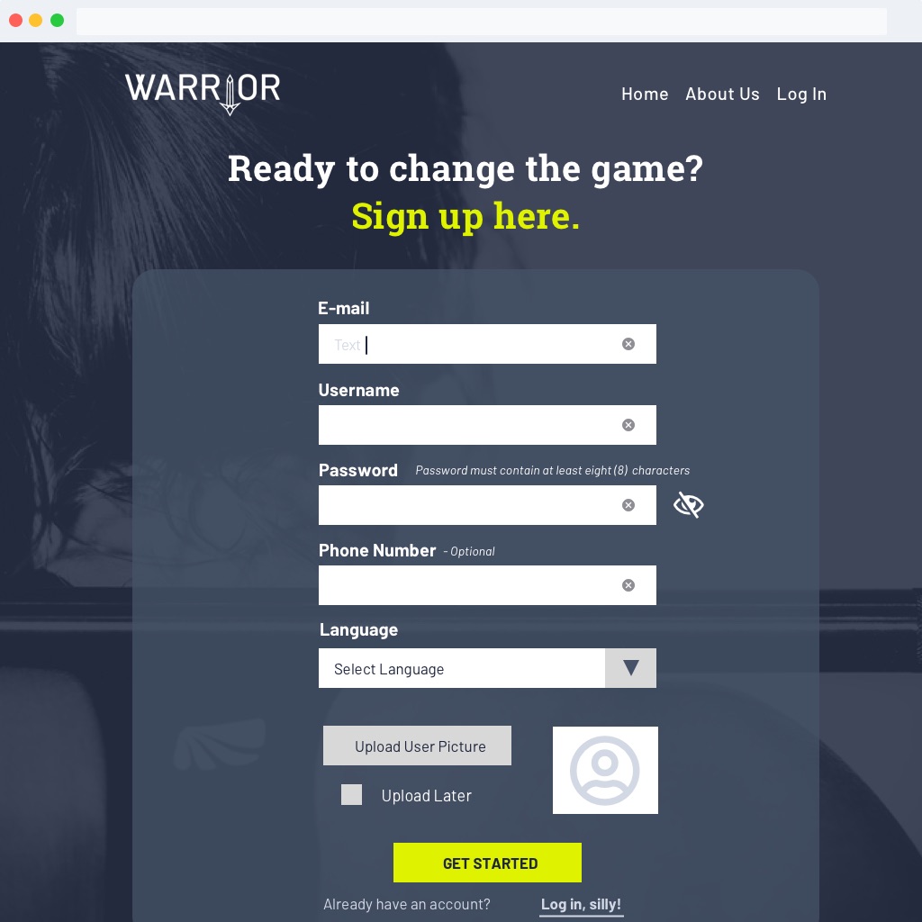
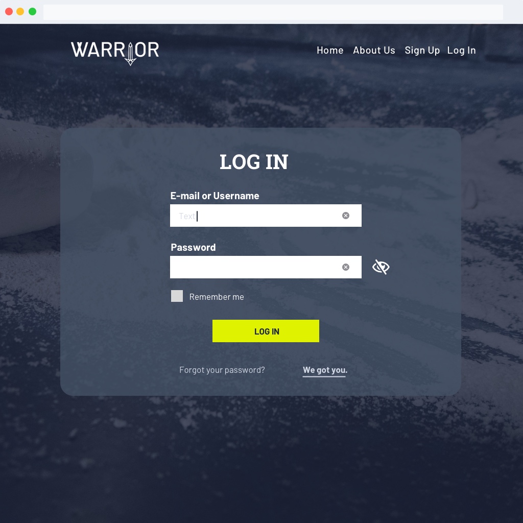
- Optimization of the forms in the “Sign Up” and “Log In” pages based on best practices
- Standardization of elements across pages based on the Design System document
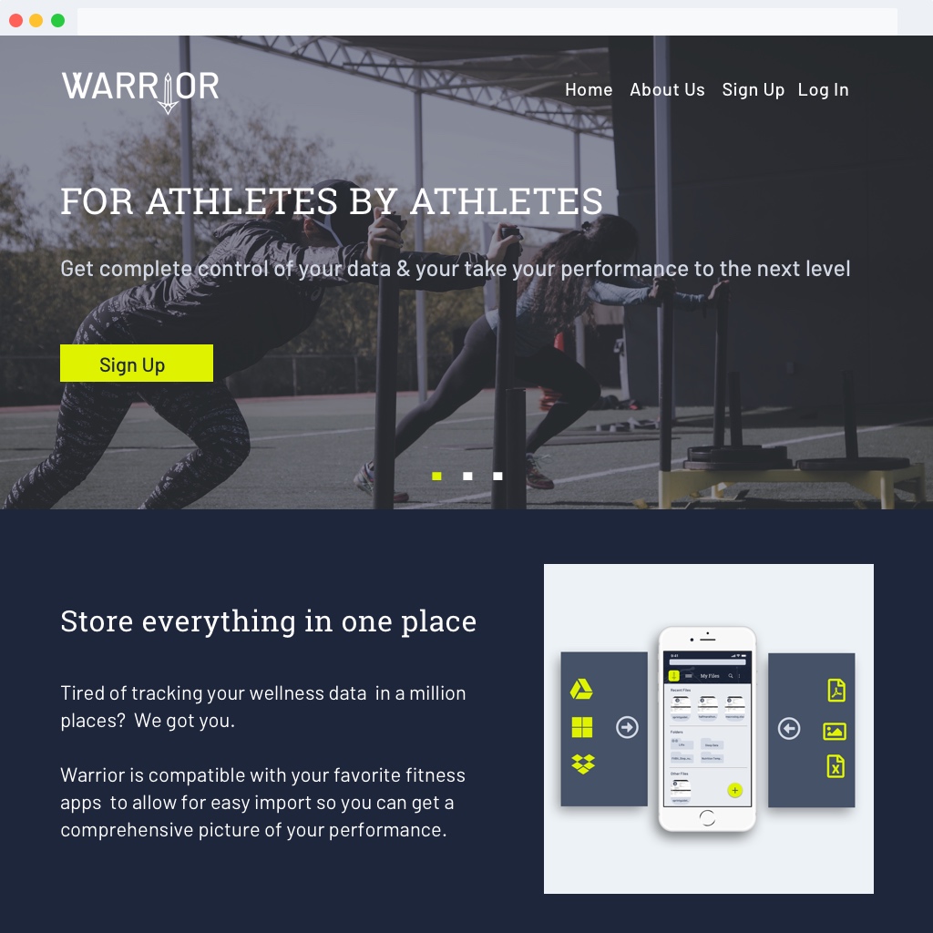
Hifi-Prototype: Desktop Landing Page
Hifi-Prototype: Sign-up
Hifi-Prototype: Log In
Hifi-Prototype: Empty State Dashboard
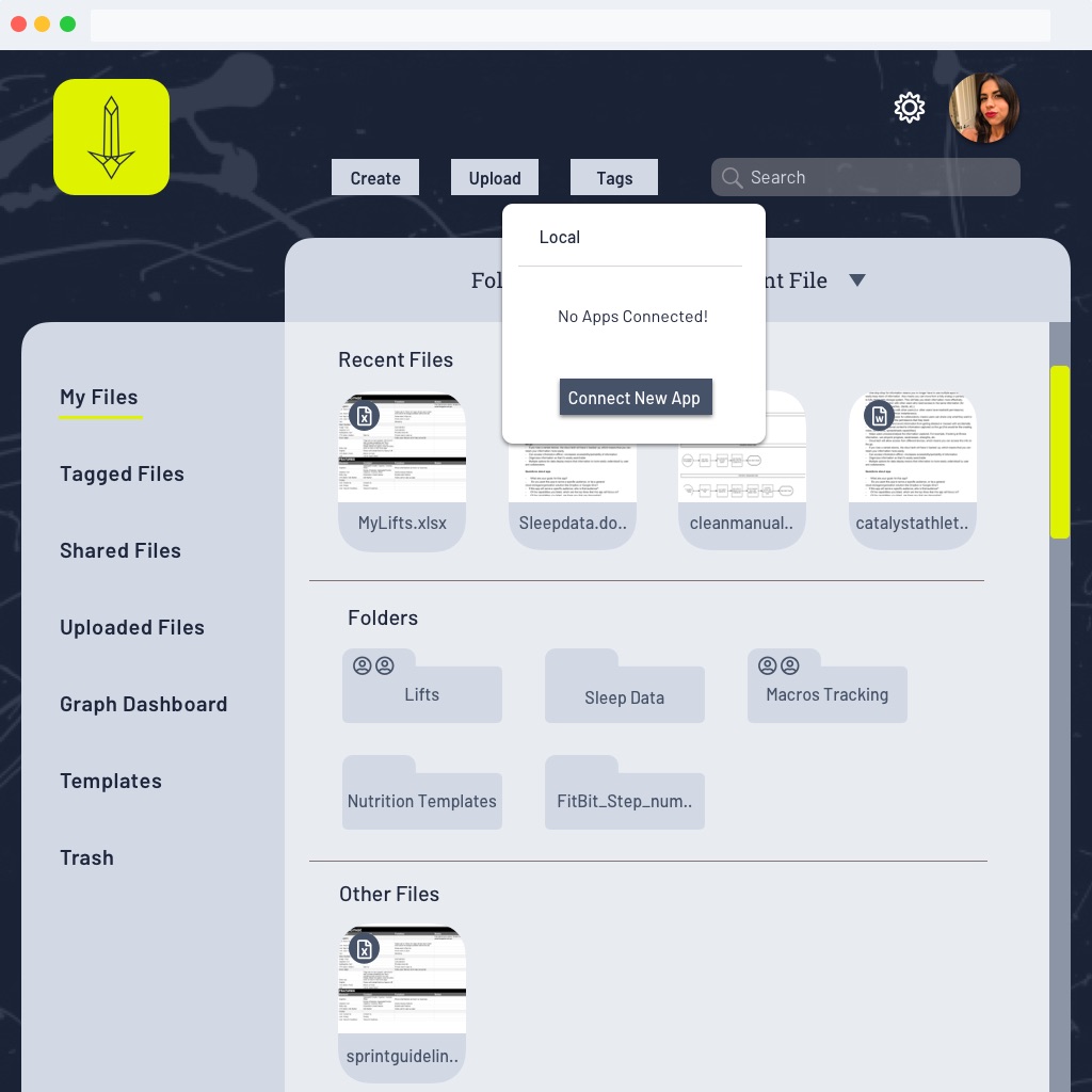
Hifi-Prototype: Populated Dashboard
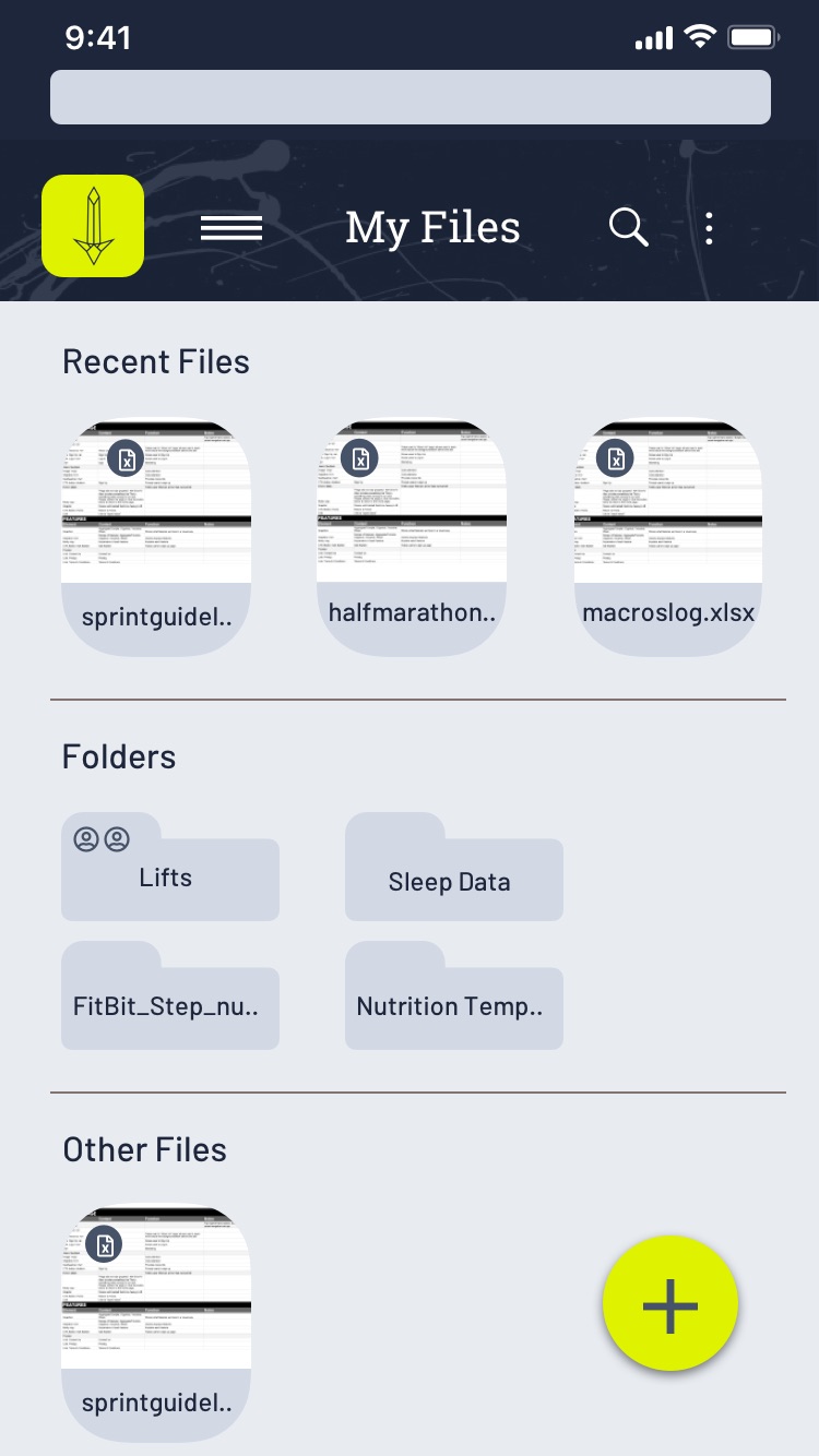
Hifi-Prototype: Mobile Dashboard
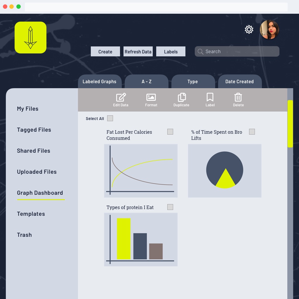
Hifi-Prototype: Graph Dashboard
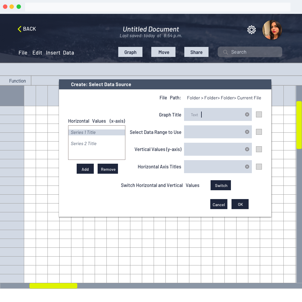
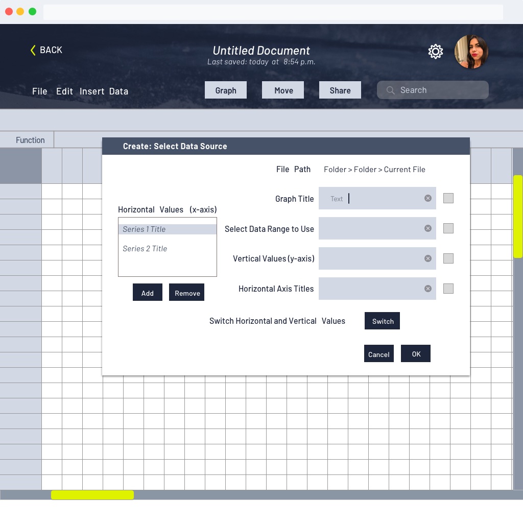
Hifi-Prototype: Spreadsheet View
Conclusions
The most surprising thing that I learned through this process was that a big pain point more “serious” athletes were facing was being caused by the very things that made fitness apps “easy” to use. In an effort to streamline processes and guide the user, many apps today have rigid settings for inputting information and preset, automated features for how that data will be displayed. While these features are helpful for less experienced users, individuals who are competitive or who have more sophisticated data tracking needs are pushed into having to use multiple solutions to track all their data. It makes it very difficult to analyze, organize or consolidate their information in a way that gives them a holistic picture of their fitness.
Lessons Learned
In retrospect, I would have liked to have deliberately gathered two equal groups of recreational vs. competitive athletes to test. This is because, throughout the process, I struggled to find a balance between addressing the pain points of the more “sophisticated” users (i.e. competitive athletes with advanced data needs) and making the product user-friendly to a wide-range of athletes. I’m still unsure if this product would have been best served with a sole focus on the “serious” athlete or not, but given more time and resources that would be the next thing I would research.
Additionally, while this was primarily a desktop app, I would have liked to have developed the mobile version of the product in more depth so that I could test the usability of the mobile versions of the file and graph creation features; these tended to be pain points for users of mobile versions of other cloud storage apps.